Many beauty addicts got their start in the drugstore. My own interest in beauty was first piqued while tagging along with my mom to the pharmacy as a middle-schooler. I fell in love with the transformative promises of skincare, haircare, and makeup, and the drugstore is where I sadly picked up some of my less responsible spending habits.
I decided to completely forgo drugstore makeup in 2018 (and I managed to keep that resolution!) however that doesn't preclude me from being tempted by cheap stuff- whether online makeup brands, drugstore skincare, or deeply discounted higher-end products.
On the face of it, accumulating lots of cheap items doesn't present as problematic as splurging on expensive ones. However, if you're like me, you can justify an expensive haul made up of cheap items, simply because the volume of items acquired seems so impressive.
I can sensibly talk myself out of a single $45 purchase at Sephora, and turn around and spend $60 at Target because my "haul" is multiple products. In theory, getting more bang for your buck sounds great- but in most cases, the bang you get isn't all that amazing. My return/discard rate for drugstore purchases is much higher than the rate for high end purchases.
Pretend the potential purchase is the same price as comparable items in your collection. I've been guilty of buying a $6 highlighter when I own multiple $30 highlighters. And why? I guess to satisfy this itchy feeling that buying a cheap highlighter would be like getting away with murder. But the fact is- if I wasn't willing to invest similar amounts of money in a drugstore item as the expensive version, and I already own an expensive version, the low price tag shouldn't be tempting at all.
Keep a piggy bank. For larger purchases, you might not want to take hundreds of bucks out of your bank account and stash them around the house. But for cheap stuff, go ahead and force yourself to go to the bank, withdraw $20, put it in a piggy bank, and see if you really want to go take that money and spend it at CVS. Many people struggle with money not being tactile and palpable, and by sidestepping the seductive credit card convenience, you will reinforce to yourself that you are spending real dollars that could be spent on better things.
Consolidate drugstore visits. As much as possible, don't make multiple trips to the drugstore in a week. If you need to pick up a prescription, and you're not quite out of toothpaste yet, buy it when you're getting your meds, otherwise you're more likely to come in next week and be tempted by makeup all over again. When I go to the drugstore and only buy one necessity, I have this maddening urge to make the trip "worth it" by buying more stuff. I'm way less likely to browse lipsticks if I have my hands full of backup floss, a case of seltzer, and a new bottle of toilet cleaner.
Make a few ground rules. Maybe you need to avoid the drugstore altogether. Maybe you don't allow yourself to peruse a few tempting brands that constantly disappoint. Or maybe you have to restrict yourself to domestic drugstore makeup only- no eBay orders or international swaps for you! Just like a diet, there are many ways to approach overindulgence. There's no one size fits all solution, but you absolutely do need to give yourself some restrictions. Write a list, and post it somewhere you can see it. If you just have the rules floating in your head, it's easier to bend and break them.
Keep all your receipts. I know, it's a pain in the ass to keep the 5 foot long CVS receipts, but you have to do it. I'm personally more likely to return a $40 foundation to Sephora if I hate it, but I easily let 5 bottles of $8-$12 foundation from the drugstore pile up until I get sick of looking at them, then throw them away. I waste more money and storage space on drugstore makeup I'm too lazy to return, because the price per item is lower. Because most drugstores don't have a sophisticated beauty rewards program, unlike Sephora or Ulta you will always need to bring your receipt along. But at least in the USA you can absolutely return used makeup if you hate it, and you should take full advantage of the return policies in place without any guilt. I keep a cardboard box next to my vanity, and every time I make a new beauty purchase, I throw in the receipt or packing slip, along with the outer packaging if there is any. That way there's no hunting for scraps of paper when I find I need to return an item.
Showing posts with label Makeup. Show all posts
Showing posts with label Makeup. Show all posts
1.22.2019
1.05.2018
2017 Favorites: Makeup
If 2016 was my year of perfecting makeup techniques, 2017 was the year I really indulged in the products that elevated those techniques. I don't have a tiny collection, and I don't have a huge one. I am pleased to say I took great joy in the products I own this year, without having excess items that didn't get much love.
Some of the products I'll be talking about were purchased prior to 2017- they're not all new or new-to-me but they represent what I enjoyed most this year!
I can't believe I've only been using this product since June of 2017. It kind of feels like it's always been there for me. In any case, since I purchased this product, I have not found its equal within or without my existing collection. I usually wear a full face of makeup with powder, highlighter, and blush, but in the photo above I was only using the Stellar foundation for my base. This is a light-medium buildable to medium-full coverage foundation with a skinlike but not overly dewy finish. It's extremely longwearing on my oily skin when set with a powder, but I have spoken to many drier-skinned women who find it hydrating/wearable for them as well.
File this product under "worth the hype, and then some." Tom Ford makes several shades of this cream/powder duo, but this is the standout in my opinion. I purchased this because smoky bronze is my favorite flattering eyeshadow color. I am pretty faithful to Urban Decay Smog for a powder shadow look, but I wanted one cream to use as a single wash in case I was in a hurry or traveling.
Although my love affair with Surratt blushes continues, my wandering eyes landed on blushes made by the Japanese brand Addiction this year. My friend with impeccable blush taste compared the texture of these blushes to Surratt, so when I visited Japan in October I took the opportunity to pick some up. Since I got home, I've regretted only buying 2 shades.
These are powder blushes that have a feel in between a traditional soft powder and a powder-gelée formula (like the Clinique Cheek Pops.) The color range is quite extensive with more than 20 available shades, but I think where they shine is their selection of nude blushes and more saturated scary-in-the-pan shades.
The two shades I first purchased are Revenge and Amazing. The former looks like a bright red in the pan, similar to NARS Exhibit A, and the second is a fuchsia-bubblegum on first glance. However, both apply so seamlessly and sheerly I have to wonder what kind of deal with the devil the formulators at Addiction have done to get this so right. When applying bright/intense blush I typically layer the most intense shade over a nude, soft one to diffuse the edges and aid blending. However, the Addiction blushes are so fine and sheer that they can be whacked on carelessly without looking streaky or patchy.
The Stila liquid glitter shadows were my gateway drug to all things glitter. In 2017, I went from owning almost nothing that could qualify even as high-shimmer to a collection that's heavily weighted in the fabulous direction. Partly through coaching by my glitter-obsessed friends, and partly just from my own experimentation, I learned how to wear glitter in a "casual" way. Although glitter is a shorthand for New Years Eve and nights out, I mostly wear glitter in the daytime to my office.
Some of the products I'll be talking about were purchased prior to 2017- they're not all new or new-to-me but they represent what I enjoyed most this year!
Stellar Limitless Foundation
I can't believe I've only been using this product since June of 2017. It kind of feels like it's always been there for me. In any case, since I purchased this product, I have not found its equal within or without my existing collection. I usually wear a full face of makeup with powder, highlighter, and blush, but in the photo above I was only using the Stellar foundation for my base. This is a light-medium buildable to medium-full coverage foundation with a skinlike but not overly dewy finish. It's extremely longwearing on my oily skin when set with a powder, but I have spoken to many drier-skinned women who find it hydrating/wearable for them as well.
To me this is a masterfully made formula, because of its versatility on different skin types, and the fact that it is such a "beautifying" foundation. Some foundation is just like paint- it covers your face in a uniform color, but it needs to be prodded, tweaked, spritzed, and buffed to actually improve your overall face. The Stellar Limitless Foundation is something that can be swiped on in a hurry, and it immediately makes you look like a better version of yourself. I can compare it in that way to the MAC Face & Body, although it is much less dewy, and has considerably more coverage. I never hear "Your foundation looks great" when I wear this, I hear "Wow your skin looks amazing!"
In addition to that rare beautifying quality that makes it so unique, the color range of Stellar's foundations is phenomenal for someone like me (neutral-warm olive) who doesn't like to use traditional yellow-toned foundation straight up. Their latest shade offering is S01, which is what I wear, and it's between an NC20 and NC25 in MAC terms, but it has a swampy yellow-green undertone, unlike the schoolbus yellow of some other companies' warm tones. This line in general caters toward the medium toned part of the spectrum, paying careful attention to the way real skintones work in real life, not just using a sliding scale and distributing 12 shades across a Pantone color gradient.
The last thing that I have to rave about is that the Stellar foundation is seamlessly skin-like. I usually dot my foundation on using fingers and then go back in to blend with a sponge, but if I get distracted in between those steps, I've actually forgotten to blend the Stellar because it meshes with my skin so beautifully. This is not just a colormatch issue, this happens because the texture is so fine and flattering on the surface of the skin. I find that it looks beautiful up-close in person but even nicer in photos, if possible. All around a truly stellar (heh heh) addition to the foundation market in 2017.
Tom Ford Eye Duo in Naked Bronze
File this product under "worth the hype, and then some." Tom Ford makes several shades of this cream/powder duo, but this is the standout in my opinion. I purchased this because smoky bronze is my favorite flattering eyeshadow color. I am pretty faithful to Urban Decay Smog for a powder shadow look, but I wanted one cream to use as a single wash in case I was in a hurry or traveling.
I have tried and hated a lot of cream shadows. MAC Paint Pots, Maybelline Color Tattoos, Kiko Shadow Sticks- to me they all had one defect in common- they do not blend out seamlessly at the edges. For some people with very sculptural, dynamic eye shapes, this is not a problem. I personally have a plain-Jane eye area. It needs carving and smoking and swooping and sculpting to look really good and most cream shadows don't allow for that.
Tom Ford Naked Bronze however- it contains multitudes. It is a sheer neutral-warm satin brown when applied lightly, and it builds to a lustrous medium dirty bronze, and then finally to a metallic chocolate bronze with an even heavier hand. Because it can be blended out to create a soft, seamless crease, it doesn't require fussing or partner products. It just looks good. And I haven't even mentioned the pressed glitter half yet- it can be left off for a smokier look or popped on top for a burst of glittery sheen. This truly is the one eye look that I can't mess up, and the fact that it can be adjusted and worn at about 6 different levels of drama/formality makes it unique among other "single wash" products.
If you are cooler than me, try the single Cream Color shade Platinum. If you are significantly paler, try the Golden Peach duo.
If you are cooler than me, try the single Cream Color shade Platinum. If you are significantly paler, try the Golden Peach duo.
Addiction Blushes
Although my love affair with Surratt blushes continues, my wandering eyes landed on blushes made by the Japanese brand Addiction this year. My friend with impeccable blush taste compared the texture of these blushes to Surratt, so when I visited Japan in October I took the opportunity to pick some up. Since I got home, I've regretted only buying 2 shades.
These are powder blushes that have a feel in between a traditional soft powder and a powder-gelée formula (like the Clinique Cheek Pops.) The color range is quite extensive with more than 20 available shades, but I think where they shine is their selection of nude blushes and more saturated scary-in-the-pan shades.
The two shades I first purchased are Revenge and Amazing. The former looks like a bright red in the pan, similar to NARS Exhibit A, and the second is a fuchsia-bubblegum on first glance. However, both apply so seamlessly and sheerly I have to wonder what kind of deal with the devil the formulators at Addiction have done to get this so right. When applying bright/intense blush I typically layer the most intense shade over a nude, soft one to diffuse the edges and aid blending. However, the Addiction blushes are so fine and sheer that they can be whacked on carelessly without looking streaky or patchy.
Stila Magnificent Metals Glitter & Glow Eyeshadows
The Stila liquid glitter shadows were my gateway drug to all things glitter. In 2017, I went from owning almost nothing that could qualify even as high-shimmer to a collection that's heavily weighted in the fabulous direction. Partly through coaching by my glitter-obsessed friends, and partly just from my own experimentation, I learned how to wear glitter in a "casual" way. Although glitter is a shorthand for New Years Eve and nights out, I mostly wear glitter in the daytime to my office.
The Stila shadows made the transition from a satin/pearl dimension to the glitter life totally seamless. My favorite shades from the line are the ones with no base tone, as they make versatile toppers for any eye look. The Gold Goddess shade is a neutral, not-too-yellow gold, and Diamond Dust is an ultra-reflective silver with some holographic sparkle. I don't find too much extra utility in the shades with tinted bases, because I prefer to do 90% of my eye look with powders, and add sparkle as a final step. However I have seen many people wear the colored-base Stila shadows beautifully. My personal favorite ways to wear them are as a smattering on the inner eye corner, all along my lower lashline, and as the center "pop" in a halo eye.
These shadows make glitter application foolproof, as they require no special primer, they do not create excessive fallout, and the formula distributes glitter very evenly with no effort. I particularly enjoy that the pieces of glitter are quite flat, large, and irregular, which gives a broken-glass type effect. I find it to be more editorial and interesting compared to what I call "pinprick" glitter which often looks more like remnants of a kindergarten craft project.
MAC Next to Nothing Pressed Powder
One of my greatest makeup challenges is achieving a dewy, glowy base while keeping my makeup in place for 10+ hours. It often feels like you have to pick one or the other as an oily-skinned person, but this year I tried the brand-new MAC Next to Nothing powder and all my satin-dew dreams came true. I was a devotee of the famous Laura Mercier translucent loose powder, but I always had a few complaints. It was just a hair too matte and quite inconvenient for travel. The MAC powder improves upon both of those issues- it has a beautiful "strong" setting power but it only barely mattifies the skin/foundation. It's travel-friendly and comes pressed in the standard MAC compact.
I use this powder in the shade Light Plus. It does not offer any coverage, but it is not a true translucent powder. It took me 6 months to fully use up a single compact, and I gladly repurchased it when I realized that all the other powders in my stash were seriously lacking. I prefer it to the sexier-looking Charlotte Tilbury Airbrush Powder, which is ever so slightly too-mattifying, and on the flipside actually has worse oil control compared to the MAC.
I use this powder in the shade Light Plus. It does not offer any coverage, but it is not a true translucent powder. It took me 6 months to fully use up a single compact, and I gladly repurchased it when I realized that all the other powders in my stash were seriously lacking. I prefer it to the sexier-looking Charlotte Tilbury Airbrush Powder, which is ever so slightly too-mattifying, and on the flipside actually has worse oil control compared to the MAC.
Clinique Chubby Stick in Whole Lotta Honey
When I first started wearing lipstick, it was always fully opaque, satin or matte formulas. I scoffed at the idea of sheer lipsticks, partly because I recalled trying crappy tinted balms in the past, and also because I doubted the impact and definition a sheer formula could offer. I actually received Whole Lotta Honey as a gift from a friend in 2016, but I really started rocking it often in this past calendar year. It's a semi-glossy sheer formula housed in a twist-up crayon format, and its magic lies in the exact balance of depth and pigmentation. Most sheer lipsticks are too weak to make a difference, or too pigmented to be considered low-key. I have crooked lip lines, which means most lipsticks require application with a lip brush to look decent. I can literally scribble Whole Lotta Honey on without a mirror and it looks good, no, great.
This swatches a muted orangey-brown but once applied to my lips, it manifests as a peachy nude. My natural lip tone is a pale, dead-looking cool pink, which doesn't harmonize well with the warmth in the rest of my features. Whole Lotta Honey goes with any subtle look, and most warm-toned dramatic looks. It even works well with some cooler eye looks, depending on what blush I pair with the look. It also works well to modify many of my other lipsticks. Layered over a too-stark or too-dry color, it can add plumpness and warmth where it's missing. Most of my lip products stay in my bookshelf where I can pick through them based on what my mood is that day, but Whole Lotta Honey literally lives on my vanity. I use it so often, alone or layered with other colors, that it doesn't make sense to ever put it away!
NARS Audrey
On the heels of a rave for a super-subtle lipstick, let me rave a bit about one of my favorite dramatic lipsticks of the year. NARS Audrey is a satin-finish berry that has some magical undertone I cannot find a perfect dupe for. I actually avoided buying this lipstick for over a year because it seemed crazy to pay NARS Audacious prices for a berry shade, a lipstick category that is saturated at drugstore and high-end price points. But in this case, I ended up wasting more money on failed dupes than I would have if I'd just shelled out for Audrey from the beginning!
Audrey is uniquely flattering for my muted, yellowy skin. It's neither too bright nor too muted. Berry shades with too much brown tend to make my face look dull or dragged-down. Berry shades that lean pink turn neon on me, and that's just not the look I'm aiming for every day. Audrey is strangely muted without being brown or blackened. It is clearly cool (berry) and not a plain red lipstick. It brightens my face without screaming for attention. It just works. The lesson I learned from Audrey is that everyone can wear some version of a color category. You just have to be adventurous and willing to kiss a lot of lipstick frogs.
Conclusions
2017 was a great year for makeup, personally, and for the market as a whole. I learned a lot about my own face and preferences, and the fast-paced release schedule in 2017 meant that companies were constantly one-upping each other and improving their offerings. It can be dizzying to face the enormous variety on the cosmetic market today, but remember that you as the consumer can only benefit from increased competition. A competitive market economy propels technology and innovation forward, while putting a downward pressure on retail prices. The increased availability of different products should excite you, as it will allow for a collection more finely tuned to your exact preferences.
Don't ever feel that you as an individual must own all the exciting new things. Each of us can only take so much, financially and mentally. Stay focused on finding things that suit your face and your budget, and that bring you joy. I love to stay on top of new releases, but I also don't regard each new makeup collection as an opportunity to buy. If you ever feel stressed over the number of new releases, just return to what you enjoy about makeup- and focus on your own goals. Part of the reason I wrote this post is it makes me happy to use a single product to death. The more products I own, the less I can use my favorites. That's something I try to keep in mind, and it might help you if you are having doubts about your makeup collection.
12.17.2017
How I Apply Blush: Modified Igari Style
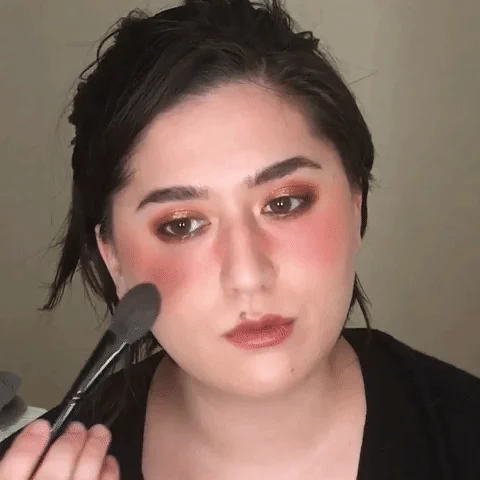
Sometimes I apply my blush in the common Western way- on the cheekbones/apples of cheeks alone. But in 2017 I discovered that I love the way my face looks with a modified igari style. Igari describes a blush trend that originated in Japan and is characterized by concentrated, high placement of bright blush. Usually the blush is placed closer to the eyes or nose in contrast with most Western blush placement trends. The name refers to the fact that it lends a slightly irritated look to the eye area, reminiscent of how you might look with a hangover. Sounds unflattering, but you'd be surprised!
In contrast to the traditional igari style, which keeps the majority of the color directly under the outer third of the eyes, I drag the color across my nose bridge and slightly further down onto the apple of my cheek.
Below are some examples of this blush placement:


I prefer to wear bold and noticeable blush, but the placement can be tweaked for a more natural look (as in the second photo above.) This blush technique takes a bit more time and a few more tools compared to the classic one color apple-of-cheek placement, but it's a great technique to have in your arsenal to switch it up.

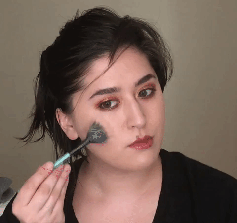
First, using your flat brush, apply your bronzer in a swiping motion. Skim the tops of your cheekbones and take it over your nose bridge. Concentrate color directly on the bridge of the nose, and along the outer edges of your cheeks. This is necessary for every look- not only "beach babe" ones. If you are after a very bronzey gold look that day, you can use two bronzers, layering a more intense orange one on top of the first neutral one.
In contrast to the traditional igari style, which keeps the majority of the color directly under the outer third of the eyes, I drag the color across my nose bridge and slightly further down onto the apple of my cheek.
Below are some examples of this blush placement:


I prefer to wear bold and noticeable blush, but the placement can be tweaked for a more natural look (as in the second photo above.) This blush technique takes a bit more time and a few more tools compared to the classic one color apple-of-cheek placement, but it's a great technique to have in your arsenal to switch it up.
What You'll Need

Basic supplies needed for this look
- Bronzer: that suits your skintone- keep it relatively neutral and matte, as you will want it to blend in with your skin
- Nude blush: Matte or slightly satin powder blush 1-2 shades deeper than your natural skintone
- Medium blush: Matte or satin powder blush 3-4 shades deeper than your natural skintone
- Pop of color blush: Matte or satin powder blush in a very vibrant/bright tone- stay away from anything with too much brown or gray in it
- Narrow blush brush: I suggest the Wayne Goss Air Brush or anything with similar head shape. Can substitute a flat paddle shaped foundation brush.
- Fluffy blush brush: Should still be a relatively small head- the Real Techniques blush brush is too large for this purpose. Can be natural fiber (squirrel, goat) or duofibre synthetic. I like the Suqqu Blush Brush best but Chikuhodo Z4 is a good option as well.
- Pointed blush brush (optional): Even narrower than the above two brushes, but with a pointed tip for precise dotting of color. Can substitute a large fluffy eyeshadow brush. I used the Wayne Goss 02 Powder Brush.
Please take special care to coordinate your blush colors. By that I mean you must match the temperature of your blush tones (warm, neutral, cool.) You do not want to have too much contrast in undertone because we are already working with variation in depth, so we will rely on the harmonious tones to carry the look.
If you use something like Hourglass Dim Infusion (a peachy orange nude) topped with NARS Dolce Vita (a rich neutral berry) you will not find it easy to create a harmonious and well-blended but intentional look. Mixing undertones in a complex blush look is possible, it's just not something to attempt before you've practiced the basics.
Before Beginning: Base Makeup
Complete your base routine with foundation or concealer, whatever you like. Take special care to set your foundation in the cheek, cheekbone, and nose area with plenty of powder. You do not want any tackiness or dewiness to remain.
Highlight in the normal fashion (tops of cheekbones) if you like. If you are using mostly luminous/satin blushes, skip this step.
Highlight in the normal fashion (tops of cheekbones) if you like. If you are using mostly luminous/satin blushes, skip this step.
 |
| Highlight (if desired!) |
Step 1: The Stripening
First, using your flat brush, apply your bronzer in a swiping motion. Skim the tops of your cheekbones and take it over your nose bridge. Concentrate color directly on the bridge of the nose, and along the outer edges of your cheeks. This is necessary for every look- not only "beach babe" ones. If you are after a very bronzey gold look that day, you can use two bronzers, layering a more intense orange one on top of the first neutral one.
 |
| Use horizontal tapping and swiping motions with bronzer |
Then take your nude blush and the same brush, and retrace the bronzer placement. Feel free to overlap or go outside the border you created, the bronzer will serve as a guide that allows for a fuzzy pre-blended edge with little extra work. Make sure to only use horizontal strokes. This will serve as the stabilizer for the more tricky vibrant colors you layer on top- the fact that it's a nude blush will mean it will blend itself without harsh borders.
 |
| Striping motions to apply your nude "blush base" |
Step 2: The Sculpting
Now comes time to add some dimension with your second blush color. This time pick up your fluffy brush and apply your second blush in tight, circular motions. Do not cover the entire area of color, but focus on the inner portions of the face. You can sweep/brush the color that you apply outward toward the cheekbone, but focus application on the inner cheeks near your nose bridge. You should also dot the color gently across the nose bridge so the blush on both sides of your face is joined.
 |
| Gentle swirling and soft sweeping |
Step 3: The Pop
You can actually leave your blush as-is after Step 2. However I always add the final touch of a super vibrant blob of blush right under the iris of each eye. This makes the blush look very dimensional, and it also draws focus to your eyes, making them sparkle. The fresh "bloom" of color you see in all the photos at the top of this post are a result of using a saturated, scary blush, sparingly. Use a dotting motion, swirl slightly if needed. Usually very little buffing is necessary as you are placing it over a base of color, which means the edges of your bright blush won't look garish or unblended.
 |
| Adding a splash of vibrant blush finishes the look |
Step 4: Final Blend
If desired, take your original flat brush used for bronzer to smooth out the transitions. It is crucial to keep this step brief and light, because if you blend too vigorously, you will negate the use of multiple blushes, and you will find yourself with a completely uniform haze.
 |
| Keep final blend to a bare minimum |
I hope you enjoyed this tutorial and found it somewhat illuminating. I have been experimenting with this blush placement a lot this year and it is much more versatile than you might think. It also suits a wide variety of face shapes and noses, but individual exact placement will vary slightly. Experiment and let me know if you need suggestions or further pointers.
Please come visit me on Instagram and let me know what types of post you'd like me to do next!
3.24.2017
What I'm Not Gonna Buy: Sephora Sale 2017
Inspired by the Queen of Anti-Hauls, Kimberly Clark (Clark...Clark), and the awesome and very-conscientious Renee over at Bad Outfit Great Lipstick, I put up an instagram post on the revelations I had about the blush haul I had planned for Sephora's upcoming (semi-annual) sale. Once I did, it got my Makeup Rehab juices flowing, and I felt like writing an extended cut of that post, including all the other shit I was contemplating adding to my collection, but ultimately decided against.
Bite Beauty Whiskey Lipstick
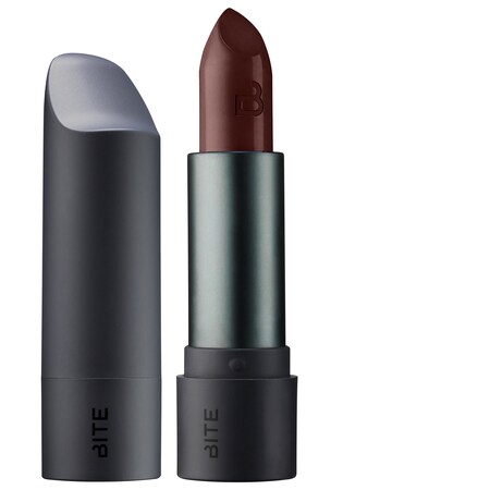 |
| via Sephora.com |
Why I Want It:
- It's very similar to a DIY shade I made on my own that is beautiful but wears horribly and fades immediately.
- It's part of my favorite lipstick formula line (the Amuse Bouche line.)
- It looks really nice on the brunette ladies I've seen wearing it.
Why I Don't Need It:
- I don't wear vampy lips in warmer months- even though my inner goth wants to, I stay in the nude-to-jewel toned shades until October. If I really want this shade, I can just as well buy it in the fall Sephora sale and enjoy using it immediately.
- I have several dark lipsticks already, which are going to expire in the next few years, and every new lipstick I bring in is incremental "loss" of days I could be wearing all of those.
- I already own Bite Portobello, a true brown which looks ghastly on me alone, that I can easily mix with a red lipstick I own to get close to this shade.
3.08.2017
How Do I Pair Blush with Lipstick?

I frequently get asked how to figure out what colors to pair together- most often people are puzzled at how to make a blush/lipstick combo look "right." It comes down to a few factors, and for beginners, I think it's best to start with learning the rules before you start to break them. That does not mean there aren't many exceptions to every "rule." But there are basic guidelines that help to understand and support wild experimentation, even if you like a very dramatic look and mismatched undertones.
This post is intended to help you if you apply your makeup and find yourself wiping off your lipstick or your blush because you had no idea what the colors would look like before you applied them, and you ended up hating the combination. If you catch a look at yourself in the mirror and think Is that my face? Makeup is not just face paint- not unless it's stage or special FX makeup. You want makeup to make sense in the context of your features and coloring.
All of the following lip/cheek pairings are "off" in one way or another. Sure, they aren't wretched, but they are all combinations which can be improved by tweaking one or two elements.


2.03.2017
Beauty Trade-offs
When discussing value, in any category of your life, you always have to consider the trade-offs inherent in any decision. In a basic sense, a trade-off refers to the idea that, for every decision you make, in order to gain something, you have to lose something else. Often it's not all-or-nothing. Usually it means you give up a portion of one priority in order to increase the portion of the other priority.
In beauty, I always think of this concept when I see beginners requesting the impossible e.g. "I really want to find a foundation that's hydrating for my dehydrated skin, but doesn't look greasy, and sets to a matte finish, but also looks good topped with powder." The big lesson that most people learn over time is that you can't have everything all at once- as the saying goes, you can't have your cake and eat it too.
When it comes to beauty purchases and implementation of your beauty products, it's important to balance the priorities you have (like oil-control vs. non-drying) which are potentially antithetical. Let's take an example of foundation, one of the most commonly worn makeup items. You cannot have a foundation that is 100% oil-controlling and 100% non-drying at the same time, but what you can do is decide for yourself how to balance those preferences to find your optimal combination.
Let's simplify it and pretend that foundations have a linear relationship between oil-control vs. ability to moisturize the skin. For every percentage drop in oil control, you gain a percentage of moisturizing ability.

1.27.2017
Basic Eyeshadow Placement Guide
This is a general beginner's guide for my go-to shadow placement. I would like to emphasize that using fewer products is an option, however I think for a beginner, it actually makes sense to use more colors and blend less. The fewer colors you use, the more active blending you have to do, and that is the part where practice/skill are important. If you are frustrated with your blending abilities, try using a few extra colors instead of trying to just blend two disparate shades together.


Subscribe to:
Posts (Atom)